How can you use R to clean up messy spreadsheet data for visualization?
Cleaning spreadsheets made fun and easy
In my first Data Rampage newsletter, I wrote about the different types of data that you will typically encounter inside a company:
Production / backend data: This is the data that is stored in the backend server(s) and is essential to the proper functioning of the service.
Frontend / behavioral data: This is the data that is collected based on user behavior on frontend services on web or mobile; generally this is collected on the device, but sometimes it is sent from a server instead.
Third-party data: This is a catch-all term for data that is stored on external services and then imported to your data infrastructure via API (or possibly some other method). The most common types of third-party data would be marketing and sales data from systems like Google Ads, Facebook Ads, Hubspot, Mailchimp, or Salesforce.
Other internal data: Is there a correct term for this stuff? If there is, I don’t know it. I sometimes call this ‘mushy data’, but in any case what I mean is the universe of spreadsheets that exist within the business that contain highly relevant information about different aspects of business performance on topics like finance, sales and marketing.
The fourth type is an interesting one, because it seems to attract relatively little attention in online data discussions; how can you as a data professional take spreadsheet data from other parts of the team and prepare it for analytical use?
In an ideal world you as a data leader would only deal with immaculately clean data sets, those that require no grunt work to prepare for analysis and other cool projects.
That’s not the world we live in, though …
Realistically, a lot of crucial data in any given business is happening in spreadsheets, and for data teams these can be a treasure trove of helpful information that can be used to add extra richness and context to data coming from the first three types I discussed above. Unfortunately, however, much of this data is not ready for analytical use, so if you want to ingest it into a data warehouse or even just make a visualization with it, you will need to clean it up.
I know I’ve buried the lede, but this post is about exactly that: how to take a spreadsheet that is messy (well, only somewhat in this case), and clean it and prep it for visualization use.
The spreadsheet in question
A few weeks ago a relative sent me an Excel spreadsheet and asked for some help cleaning it up so that they could chart the values over time and try to identify some trends. I loaded it into R, quickly tidied it up, loaded it into Google Sheets, and made a visualization with trendlines for them. Done!
Afterwards I realized that this might be a good educational example, so with their permission I’m sharing it here, although I’ve renamed the columns with the relevant measurements to ‘Variable 1’, ‘Variable 2’, and ‘Variable 3’.
If you just want the R code, it’s right here on Github.
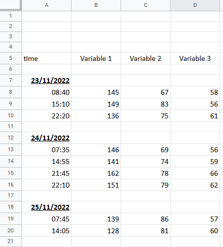
Let’s have a look at the spreadsheet:
Here’s how it’s structured:
There are four columns, with the left-most having both dates and times, and then three variable columns
The dates are on rows of their own, while the variable measurements are aligned with the times they were taken
There are spaces between each date-time block
Taken together, this is pretty easy for a human to scan through and read, and unfortunately not easy to use for any kind of analysis. To be able to build a time series, you need to reorganize the data so that each measurement is on the same row as the date it was taken on, at the bare minimum.
Doing this manually means dragging around the dates, deleting the empty rows, and other work … with over 250 rows to work through, this will get old, fast. A better way is to do it via code, and in this post I’m going to walk you through exactly how I did so.
Loading and Cleaning
The original file came to me as an Excel document, and I loaded it into R using the readxl package, however for the sake of this newsletter, it was easier for me to load the anonymized data into Google Sheets, which you can access here.
If you want to follow along, you will need to have a Google account and follow these steps:
Install RStudio as your IDE
Use this code snippet to install the necessary packages and follow along:
install.packages(c("tidyverse", "googlesheets4","lubridate","snakecase"))The first step is to load the packages, authenticate your Google account, and load the data frame from Google Sheets; I’ve also included my function tidycols, which reformats column names into a nice snake case format.
library(tidyverse)
library(lubridate)
library(googlesheets4)

#function for cleaning column names

tidycols <- function(df) {
  require(snakecase)

  dfnames <- colnames(df)

  dfnames <- gsub('#','nr',dfnames,fixed=TRUE)

  dfnames <- gsub('%','pct',dfnames,fixed=TRUE)

  dfnames <- to_snake_case(dfnames,sep_out = "_")

  dfnames <- tolower(gsub(" ","_",dfnames))

  dfnames <- gsub(".","_",dfnames,fixed=TRUE)

  dfnames <- gsub("/","_per_",dfnames,fixed=TRUE)

  colnames(df) <- dfnames

  return(df)

}

#authenticate

gs4_auth()

#read the file in

url <- 'https://docs.google.com/spreadsheets/d/1n1YZSThrLEjqj7kvRD8rKJsPF5NAe_kGhSzmZtYv4RM/edit?usp=sharing'

test <- read_sheet(url,skip = 4,col_types = 'c') %>%
  tidycols()
You will see in the read_sheet function, I’ve added two additional arguments besides the spreadsheet URL, these are so that I skip four rows (thus skipping the blank space at the top of the spreadsheet), and that all columns are read in as data type ‘character’’. I did this because I was worried that the first column had both dates and times, and weird stuff might happen with the auto-detect. If everything is treated as a string, you get it in and fix it later!
Let’s see what the data looks like once it’s been read in:
Well, that’s definitely it! But as you can see it’s still not particularly usable for analysis.
Let’s clean it up!
#clean the data

test2 <- test %>%
  #remove missing rows
  filter(!is.na(time)) %>%
  #create a proper date column
  mutate(date = ifelse(is.na(variable_1),time,NA),
         date = dmy(date)) %>%
  #fill missing values downwards
  fill(date,.direction = 'down') %>%
  #remove empty rows
  filter(!is.na(variable_1)) %>%
  #fix variable data type
  mutate_at(vars(starts_with('variable')),as.numeric ) %>%
  #create a time stamp
  mutate(time_new = paste(time,':00',sep=''),
        timestamp = paste(as.character(date),time_new),
         timestamp = as.POSIXct(timestamp,format="%Y-%m-%d %H:%M:%S")) %>%
  #tidy up and reorder
  select(-time_new) %>%
  select(date:timestamp,everything())
OK, there’s a bunch of steps, so I will go row-by-row explaining everything.
Remove any rows where there is no value for ‘time’; this gets rid of the spacing rows
Create a new date column by taking the value from ‘time’ if ‘variable_1’ is empty, otherwise leaving it blank
Fill the ‘date’ column downwards; this fills empty space until the next value, so each measurement will now have the correct date
Remove every row with no value for ‘variable_1’, this removes the rows that have a date value in ‘time’ but are otherwise empty
Convert all the variable columns to a numeric data type
Create a timestamp column by combining the pasting the date and time columns together and then converting to the timestamp data type
Re-order the columns
What does this look like after this work?
Now this is a big improvement! This is now cleaned and ready for analysis; instead of spending a long time manually deleting rows and copying and pasting date values, everything has been rendered nice and tidy in only a few lines of code.
We can take this even further by pivoting the data into a long format, like this:
test_clean <- test2 %>%
  pivot_longer(cols = c(variable_1,variable_2,variable_3),names_to = 'measurement')
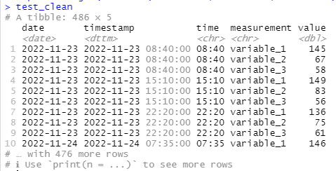
This collapses the individual variable columns into two columns called ‘measurement’ and ‘value’, making the whole dataframe longer and narrower, like this:
Loading the cleaned data back into Google Sheets
Once the data is cleaned up you can do, well, whatever you want!
But let’s say that you want to load it back into Google Sheets, here’s an easy way to do so:
#write it to a GSheet

gfile_url <- 'YOUR NEW GOOGLE SHEETS URL'

sheet_write(test_clean,ss=gfile_url)
I’ve loaded the data to Google Sheets here, so you can see what it looks like.
Bonus Time! Visualization with ggplot2
I’ve always been a huge fan of the R visualization package ggplot2, which I think is possibly the single best charting tool out there, paid or not.
As a bonus, therefore, here’s a quick visualization of the data, where I’ve created an average value for each date:
As you can see, this is quite a nice, clean looking chart.
Here’s the code I wrote to make it:
test_clean %>%
  #get the average value per day
  group_by(date,measurement) %>%
  summarize(value = mean(value)) %>%
  ungroup() %>%
  #visualize it with date on x axis and value on the y
  ggplot(aes(x = date,y = value,col=measurement ))+
  geom_line()+
  scale_x_date()+
  scale_y_continuous(limits=c(0,160))+
  theme_minimal()+
  #add a trendline
  geom_smooth(method='lm',se=F,linetype = 2,alpha=0.35)+
  ggtitle('Data Rampage Data Cleaning Example')+
  #move the legend to the bottom
  theme(legend.position = 'bottom')+
  labs(col='Measurement')+
  ylab('Value')+
  xlab('Date')
Housekeeping
Thanks for reading! Next up, either later this week or early next week I’m going to be starting a multi-part series on tracking design, a topic that is really important, but where it can be difficult to find good quality information on the internet. I’m going to look at the fundamental questions you need to ask when creating a tracking plan, and I’m also going to go through a few distinct approaches to tracking design.
Ironically enough, I saw that Timo Dechau of Hipster Data Stack has in fact this week written about exactly this same topic; and his post is well worth reading for anyone interested in the topic:
My thoughts and emphasis will be somewhat different, but I still highly recommend reading this.
If you missed my last post on marketing attribution using Snowplow Analytics, you can see it here:
I ended up doing some rewriting of it from the original version, but the core information is there. I think it’s an interesting (and helpful) read!
One last (music) thing
Every post ends with a dj mix from my massive back catalogue (I’ve been a dj for almost 26 years now). Today, I’m sharing Don’t Give Up, a breakbeat mix I did two years ago. This isn’t my main usual style, but I’ve really enjoyed the midtempo breakbeat revival that’s happened in recent years, particularly in the UK, so I put this mix together of some of the records in that style that I’d picked up recently. I am really happy with this one!
That’s it for now, thanks for reading and I’ll be back soon …


